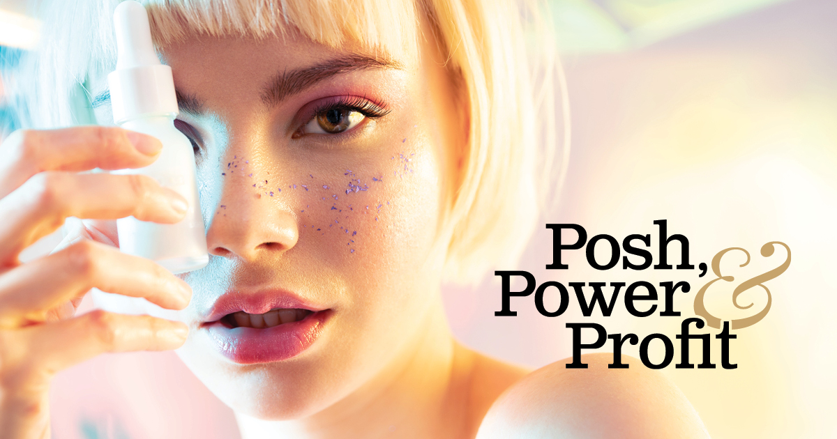
06 Jun Sephora: Used to Be Aspirational. Now It’s a Field Trip.
I’ve been designing brands and dissecting websites for over 25 years. What still gets me is how far a brand can drift from the business or human behind it… and how comfortable everyone becomes with the distance.
I have opinions. And unlike the people tapping their fingernails on overpriced skincare packaging for eight seconds of content, I’m going to use my words.
In this series, I’ll showcase one high-profile brand or business each week. You’ll get my honest read: what landed, what didn’t, and what nobody on their team had the nerve to say.
No agenda, algorithm, or sponsorship influence. It’s just me (and my nerve).
This Week: Sephora
A multinational beauty and personal care retailer founded in Paris in 1970, Sephora has spent over five decades building one of the most recognizable retail brands in the world… and the last five years doing its level best to undo that.
The First Impression
The in-store brand identity is genuinely impressive. The black-and-white stripe is one of the most timeless, adaptable visual assets in retail. It’s emblazoned in the minds of multiple generations. The wordmark is clean, modern, and does exactly what a good logo is supposed to do: nothing flashy, everything intentional. At first blush, you think this is one of the most sophisticated beauty retailers on the planet.
Then you find their Instagram.
What They Got Right
The core brand architecture — the logo, the stripe, the store design — was built with real conviction and restraint. The black-and-white palette communicates authority. That visual shorthand has survived decades of trend cycles. Someone made a very good decision a very long time ago, and the brand has been living off that equity ever since.
Where It Falls Apart
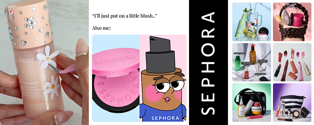
Somewhere between the store entrance and the Instagram feed, Sephora made a pivot that should never have been approved. The content is ASMR-loaded, pastel-saturated, bedazzled, and unambiguously targeted at people who still get excited about stickers on their Owala bottles. Welcome to a world of bubblegum packaging, sorbet palettes, and where “OMG adorable” is the highest compliment a product can receive.
Meanwhile, a 13-year-old is applying retinol at night, acid peels on weekends, and using a $53 scented hair mist as a substitute for basic hygiene.
The brand I once found aspirational — the one I couldn’t fully afford at 22 but planned to grow into — is now selling $32.50 lip balm to kids with birthday money who are neurologically incapable of telling an influencer opinion from medical fact. Aspirational became exploitable and it seems nobody in that boardroom blinked.
The Coherence Gap
Here’s the brand design problem nobody on their team is talking about: the visual identity says luxury authority and the content strategy says playground for teens. Those are not the same customer and they are absolutely not the same brand promise. When your core aesthetic is sophisticated restraint and your content calendar reads like a sleepover party supply list, you have a coherence problem. The dads standing outside the mall entrance scrolling their phones rather than going in? They’re giving you your most honest brand review and it’s not great.
Coherence means every element saying the same thing. The stripe and the wordmark are saying sophisticated. The Instagram is saying adorable. The product targeting is saying we’ve identified that children have money and limited judgment and we consider that an opportunity.
If It Were Mine
I’d make a decision: who is this actually for? You cannot be both the aspirational destination for a grown woman who knows what she wants and the trend-driven playground for a preteen who learned her skincare routine from a 15-second video. Pick a lane. The brand bones are extraordinary. The stripe alone is worth protecting. The content strategy needs to either grow up or fully commit to the younger market and rebrand the whole identity accordingly. Right now it’s neither, which means it’s speaking to no one with any real authority.
Left to my own devices, I’d pull the content back to the visual standard the store sets. Let the product do the talking. Stop letting baby-faced influencers be the brand voice for a 55-year-old institution.
Wow Factor Rating
2.5 out of 5
The bones of this brand are a masterclass in simplicity. The execution in 2026 is a cautionary tale about what happens when you chase an audience instead of leading one.
If you made it this far, you already know you have an eye for this!
Posh, Power & Profit is my weekly brand breakdown: one site, one honest read. Subscribe below. No spam, no fluff, no algorithm.
Want me to do this for your website?
The Site Breakdown is $147 CAD. You send me your URL and I video record a 15-25 minute designer’s read of exactly what’s working, what isn’t, and what one change would move the needle most. It’s pre-recorded, delivered within five business days, and credited toward any future work together.